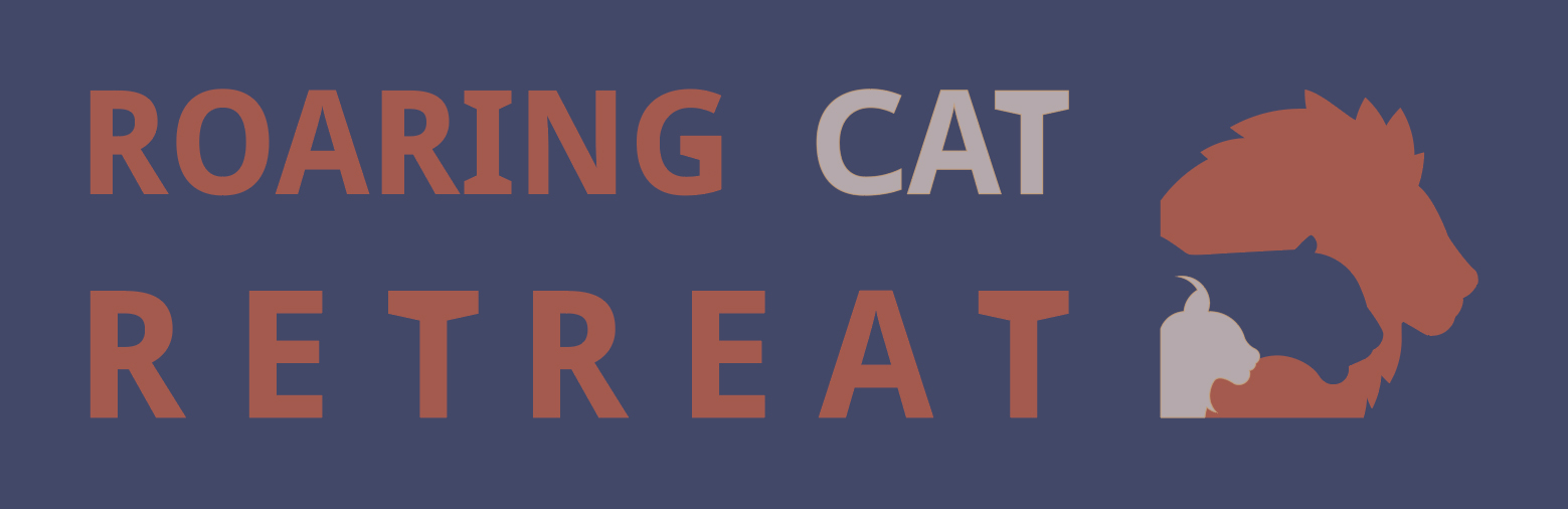
Roaring Cat Retreat was a big cat reserve in Ontario, Canada. They were seeking a new branding strategy for the imminent re-opening of their reserve to the public. Our professor had the idea of doing a competition among all the design students in the school to create a new logo and brand guide for the company. My team, with Caroline and Enkhbaatar, made a versatile logo with a 3-color scheme that could be swapped around in any combination.
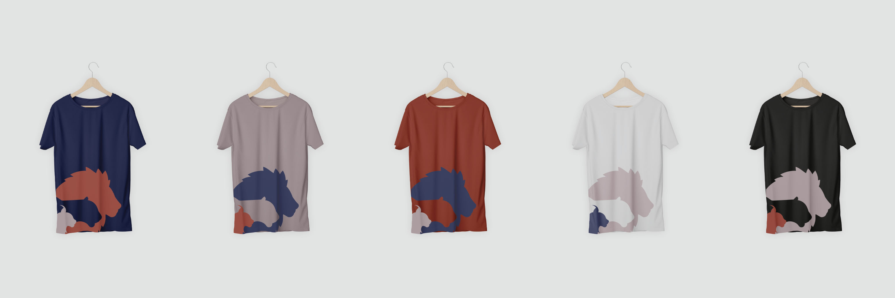
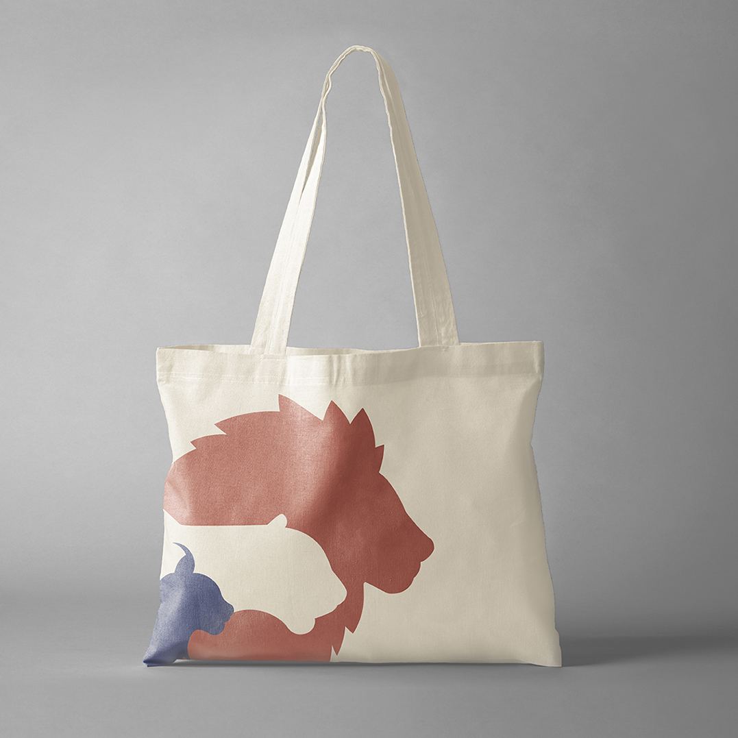
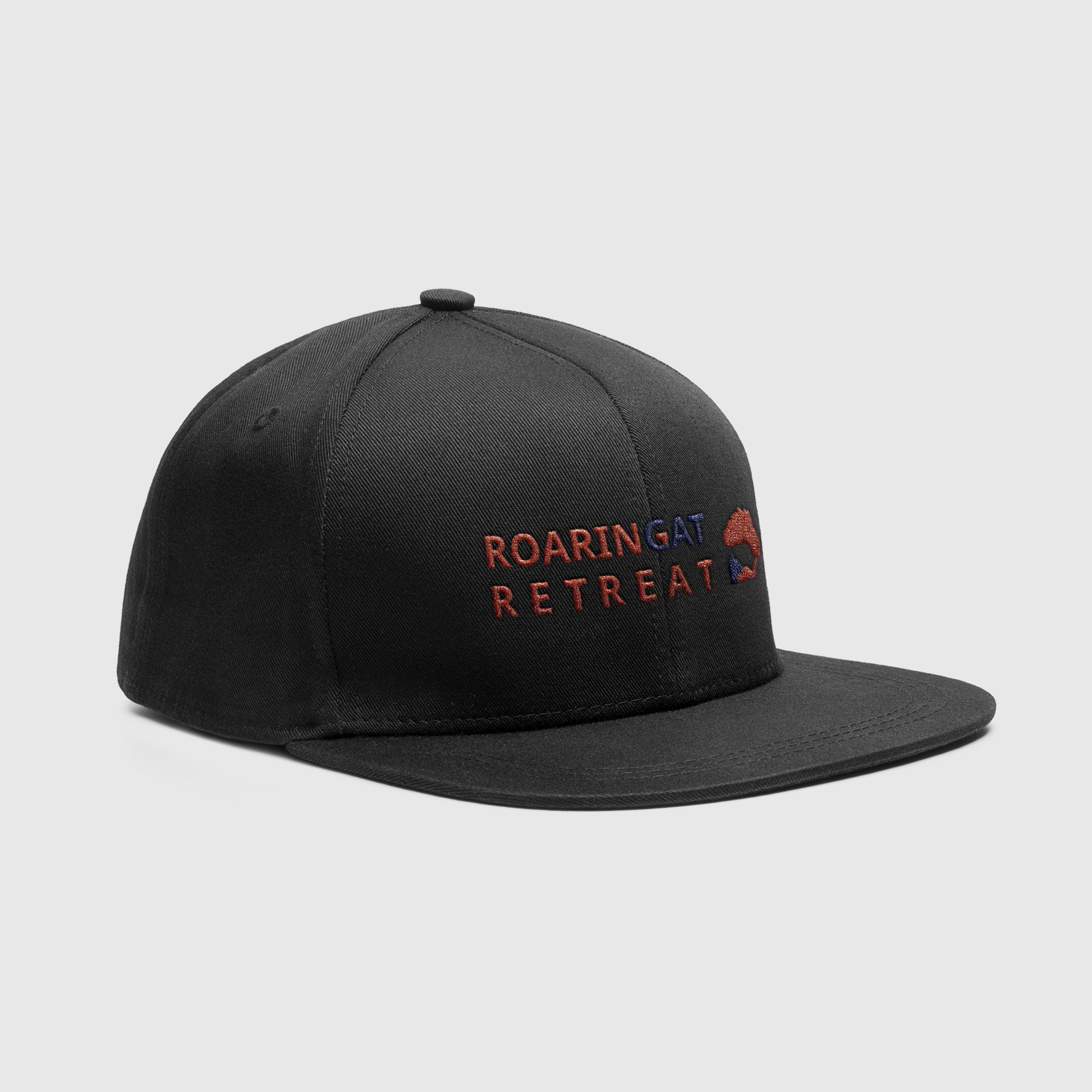
Our process focused on creating a logo that was versatile, dynamic and iconic so that it could be easily added to merchandise, a primary engine of profit for the organization.
We started out by assigning various roles for this big project based on each team members' strengths. Enkhbaatar led the way on defining the color strategy, Caroline spearheaded the inital design of the logomark and I narrowed in on a desired wordmark. Once we had each established a basic concept direction we collaborated to refine the ideas into the final design.
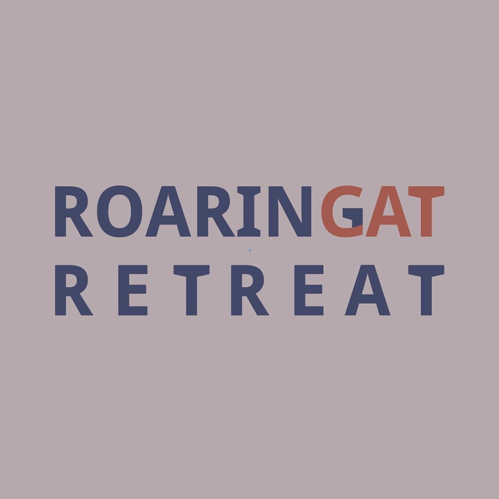
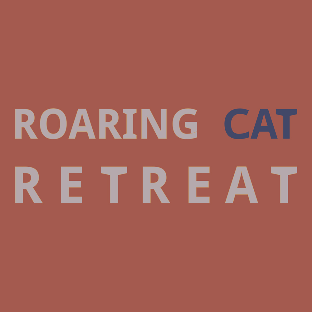
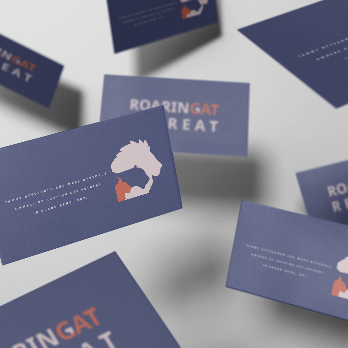
One of the major hurdles we faced was creating a wordmark that reconciled the name of the organisation. From our design brief we knew the client preferred to have the full name in the wordmark and sought various methods of making it work. In the end we decided on overlapping the G and C of "Roaring" and "Cat" as a way to concetenate those two words, making it easier to match with the larger, more spread out "Retreat". As we were not certain if this would be an acceptable end result we also had a back-up version that did not overlap the words.