Jessica Ng is starting her practice in psychotherapy and counselling and came to me to help her with creating a brand identity for her practice. Building from the ground up, I started with gathering as much information as I could about the message she wanted to convey and the experience she wants her clients to have when engaging with her brand.
Identify the message, delve into keywords and concepts associated with that message to find shapes, patterns and symbols that call back to it, then identify colours that convey the desired emotions.
The project started with an extended consultation to gather the necessary information for her message. To adhere to time constraints we delved into the colour themes that would best match the emotion she wants her clients to feel when engaging with her brand. The following step was developing several parallel ideas for the logo and reconciling the text she required with the logo, namely her name as primary title and her services as subtitle.
The design was quickly digitized and refined into the circular version of the final product. It evolved in multiple layers, first to create the under-over concept and then to blend and merge the colors.
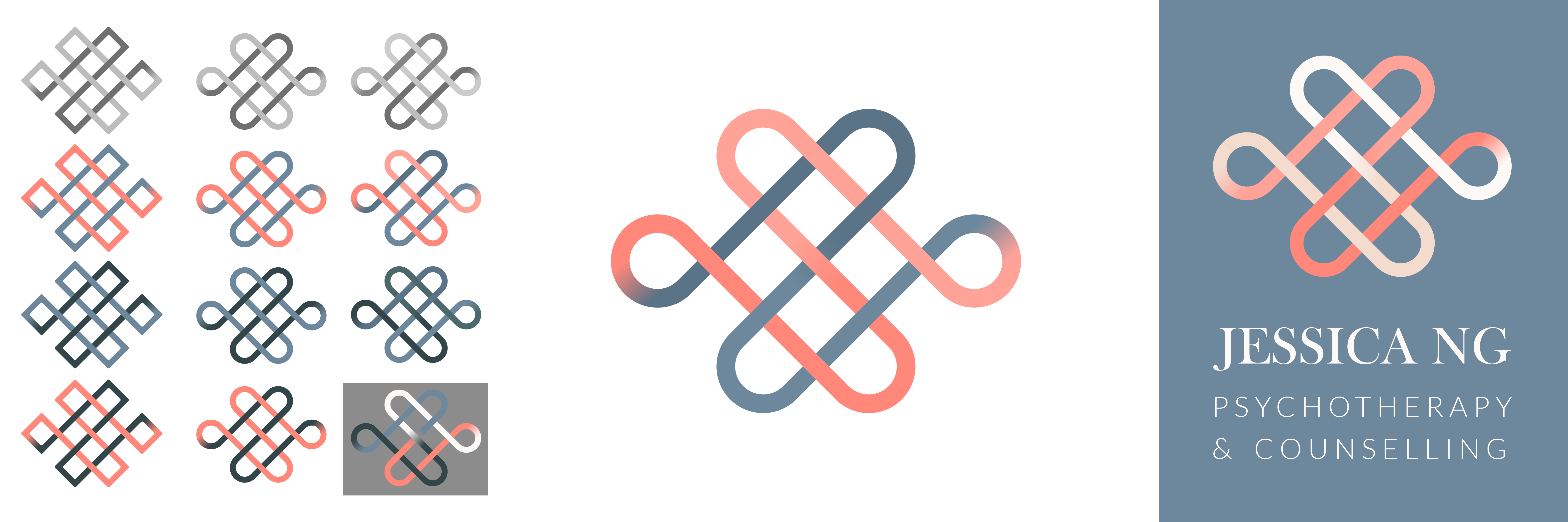
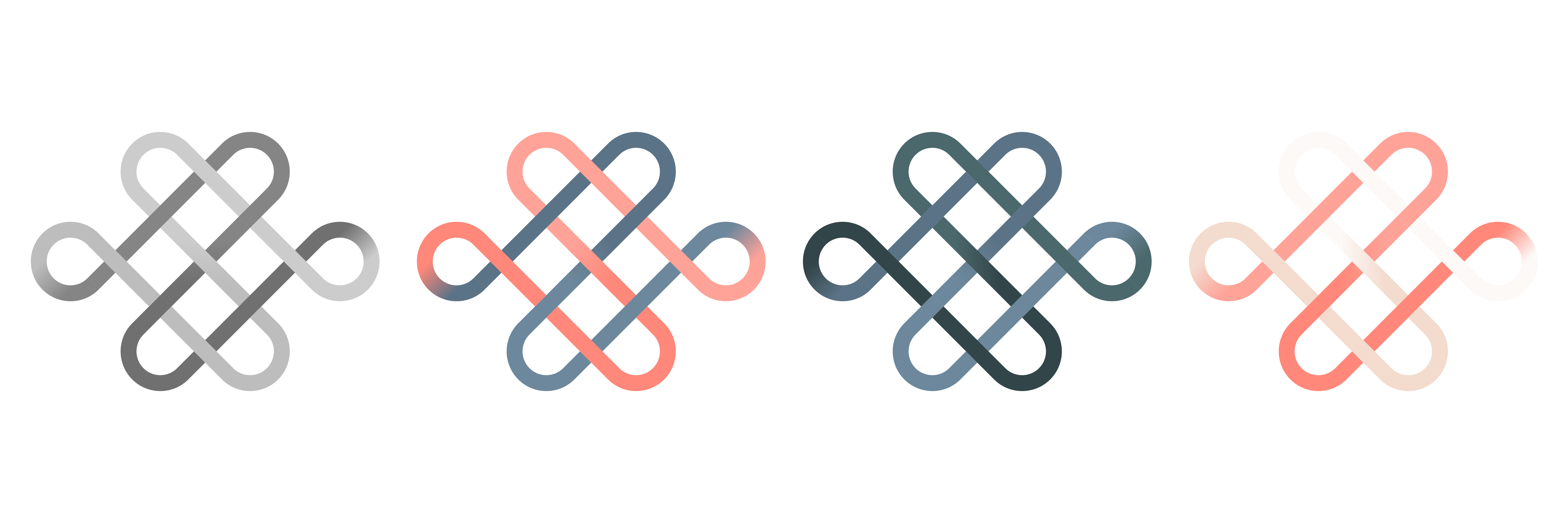
It was important to establish alternate color variants that work well in case the logo is required on media that is light or dark or too similar to the main colors. The following image showcases the main color scheme, two variants and the grayscale version.