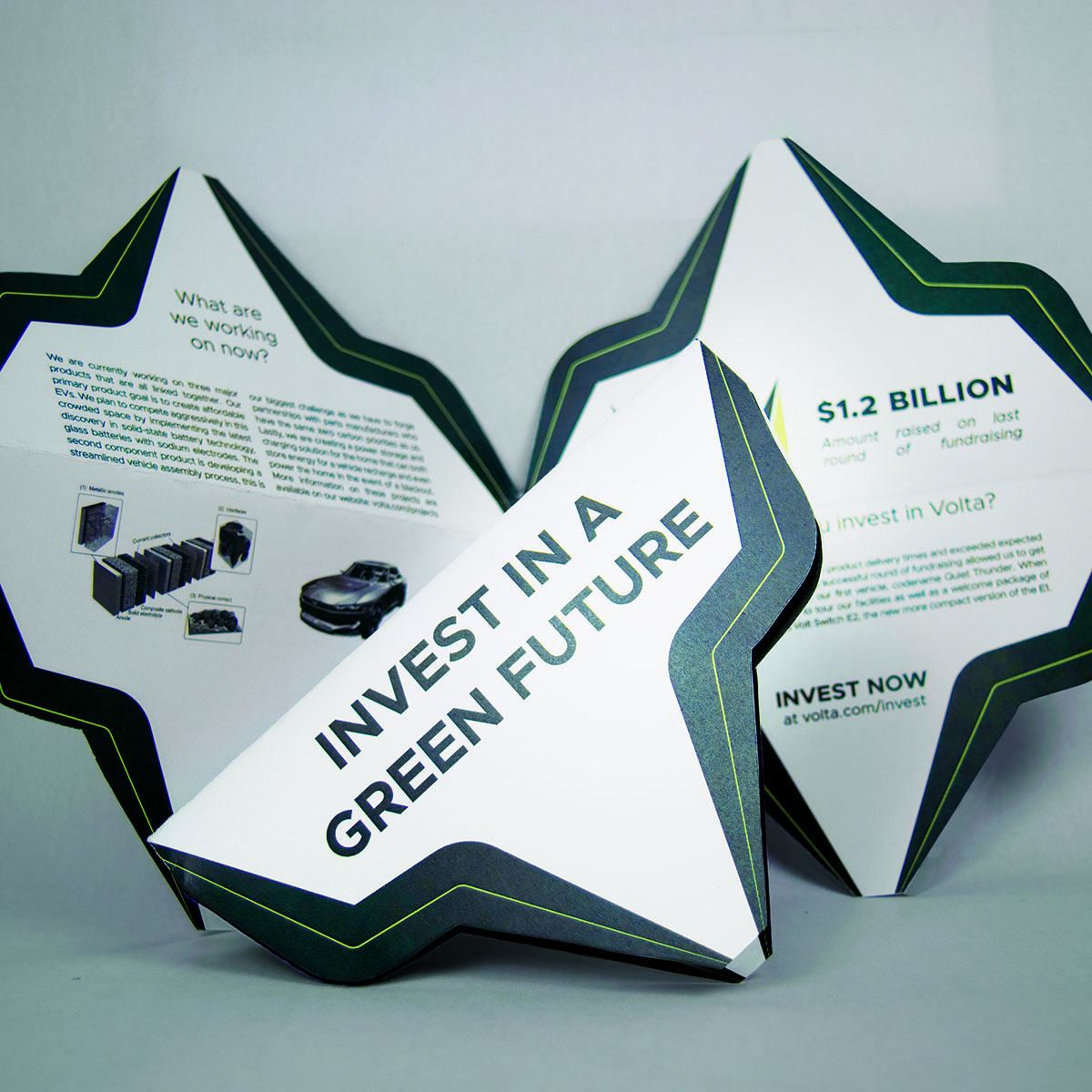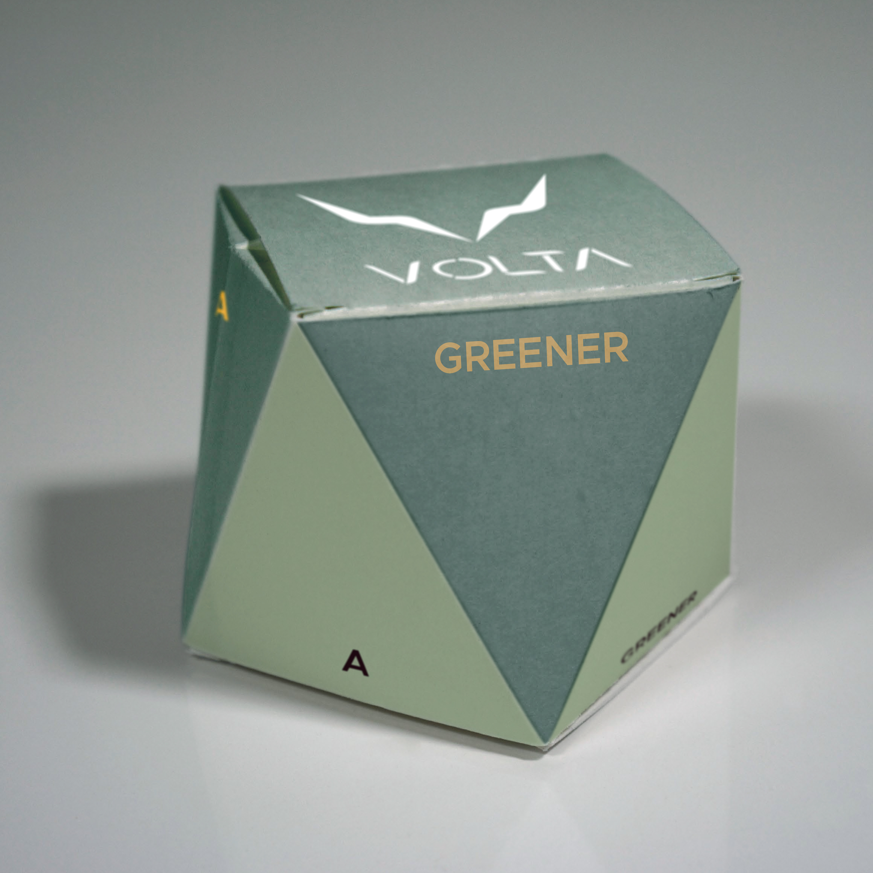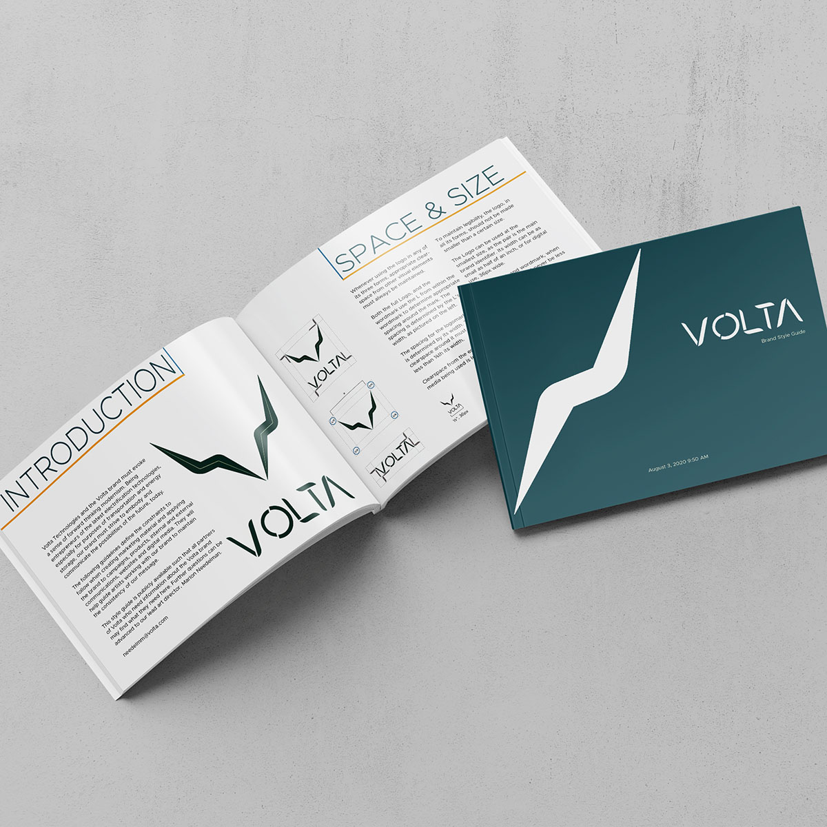
The project goal was to create a luxury brand and develop a marketing strategy as well as some material for the brand. I added a few more constraints for myself. My first constraint was to avoid using stereotypically premium colors, especially gold and silver. The second constraint was to go for a modern, minimalist aesthetic, using the common "less is more" addage. With these ideas in mind I had to then think about what kind of fictional company I would be creating this luxurious brand for.
A modern, premium company would require that partners follow the same stringent standards on human rights and ecologically sustainable practices as they themselves employ.
Having been very caught up with the emerging news of EV markets, I decided I wanted to make a luxurious electric tech company. The most well known of which today is Tesla. However, Tesla isn't just a car company, they also do energy storage and their CEO, Elon Musk, also owns Solar City, a company that makes solar panels and roofs. I knew my brand had to include not just cars but energy capture and storage as well. Also, a modern premium company won't work with just anyone, they would require the same stringent standards on human rights and ecologically sustainable practices as they employ.
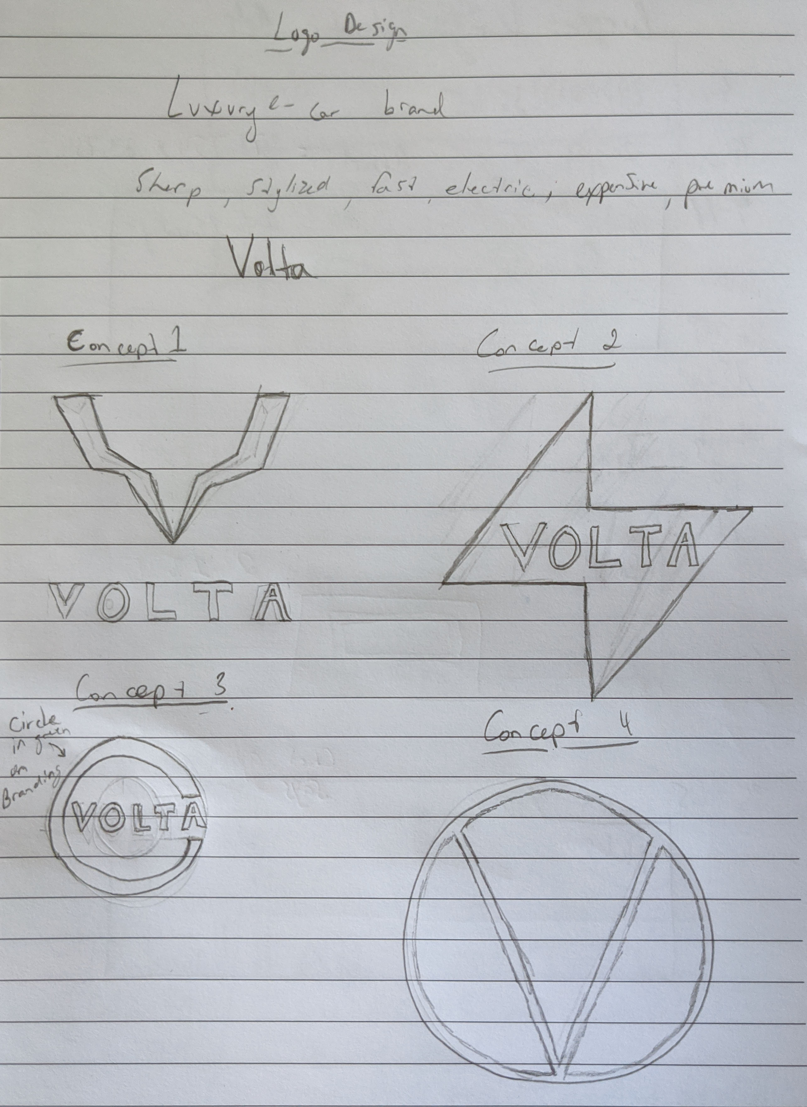
I started with the name. Alessandro Volta was the Italian inventor of the battery in the late 18th, early 19th century. What could make for a better company name than the grandfather of electricity and power? Next was the logo. I began with four sketches and took three of them into illustrator to get color and precision. My first design in illustrator of the wordmark was an instant favourite and I carried it into the three logomark designs. My first design was my favourite by far and I carried it forward to the next step of the process.

This has become my favourite project that I've worked on recently. I really like the way the logo came out and the story built around the concept feels realistic to the point that I think it can easily be mistaken for a real brand, which is, of course, the goal. I would love to work on more projects like this, helping companies create their brand identity.