Jessica Ng's practice has evolved and grown in the last three years and it has outgrown the personal brand we started with. She came to me with the new name for her business and the desire to update the brand. Still enamored with the original design, we focused on refining the more intricate details of her logo.
1) Confirm the previously established message, keywords and concepts still hold true. 2) Identify weaknesses and issues with original design as it translates to the new name. 3) Derive solutions that maintain the original feel while adapting cleanly.
As ever we held a consultation meeting to make sure the message of the brand hadn't changed and to ascertain all of her desires for the brand update. We highlighted a few aspects that needed to be addressed during this process, namely the logomark, the layout and the font choices.
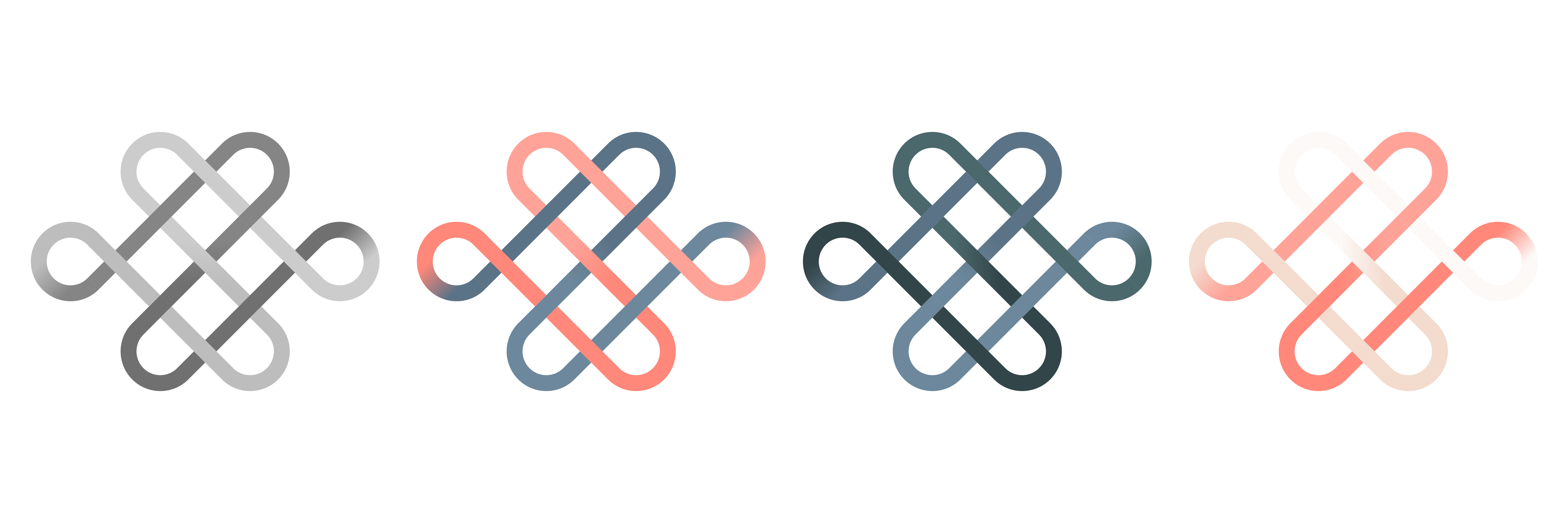
First was addressing the original logomark as it was originally too thin, making it hard to read at very small sizes. This actually kicked off a full redesign of the logomark because the original was designed by specific shapes on different layers to create the illusion of the final output. This go around, I created a detailed shape grid and used the shape builder tool to make the original "sharp-edged" shape. Then I rounded the corners and applied the same colour scheme as the previous one had.
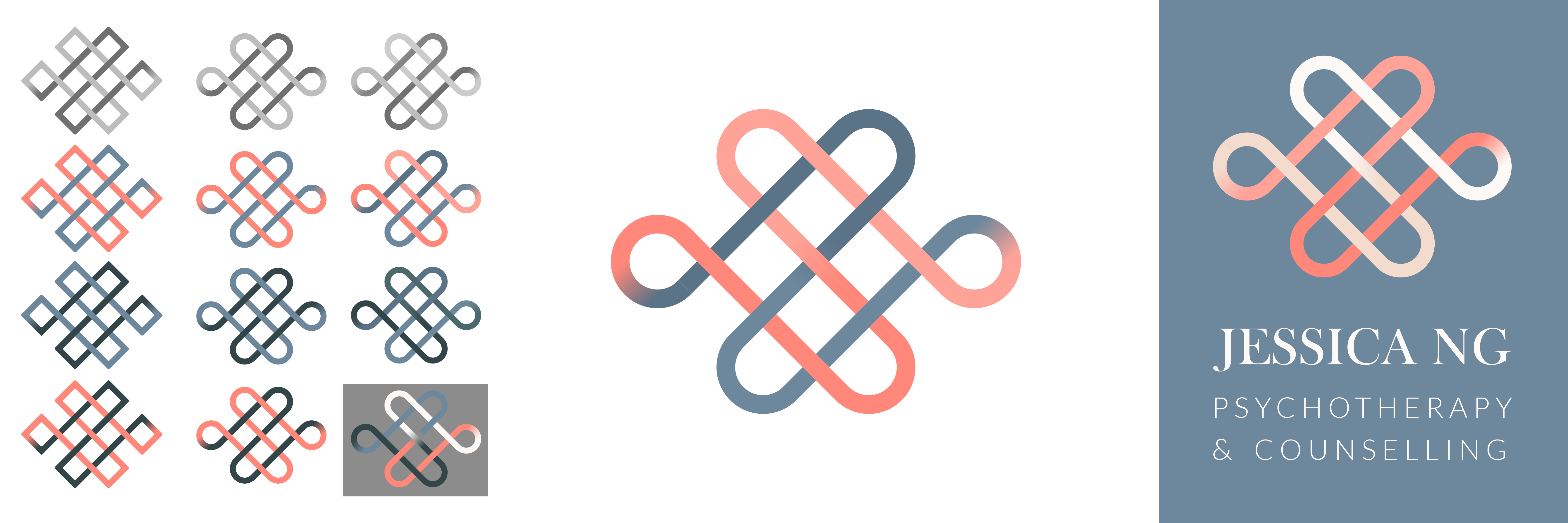
The primary layout also had to be updated. The longer name makes legible layouts more challenging so the horizontal layout became far more important. She also wanted slightly different fonts that were also available without commercial license needed.