Aude - Performance Tracking Software · UX Design
A case study in using UX principals to iteratively redesign the dashboard with the goal of driving engagement and adoption.
Industry
SaaS - Software Development
Platform - Web Apps.
Role
Project Manager, Lead UX Designer and Prototyper, Contributor to Research and Testing
Methods Used
Heuristics, Competitive & Comparative Feature Analysis, User Interviews, Affinity Map, User Persona, User Journey, User Flow, Site Map, Problem Statement, Feature Prioritization, Sketching & Design Studio, Prototyping & Iterating, Usability Testing
The Client
Aude (pronounced: aw-day) is a tool for tracking work performance in a holistic way so that engineers have neutral third-party insights, backed by factual evidence, of the work they accomplish. It captures more than just how many lines of code or bugfixes an engineer has delivered by also seeing interactions with colleagues through digital communication channels.
Executive Summary
The Challenge
Aude has been experiencing low engineer adoption of the tool so they tasked us with figuring out why and proposing solutions to help make the tool more useful, engaging and integral to an engineer’s workflow.
The Solution
Our team identified key issues such as difficulty with:
- legibility,
- unclear numbers and metrics,
- and lack of visual polish.
We tested those issues with users to validate our assumptions and researched
other approaches by competitors. We then took those lessons to design a lighter,
more approachable interface and communication strategy for the web app.
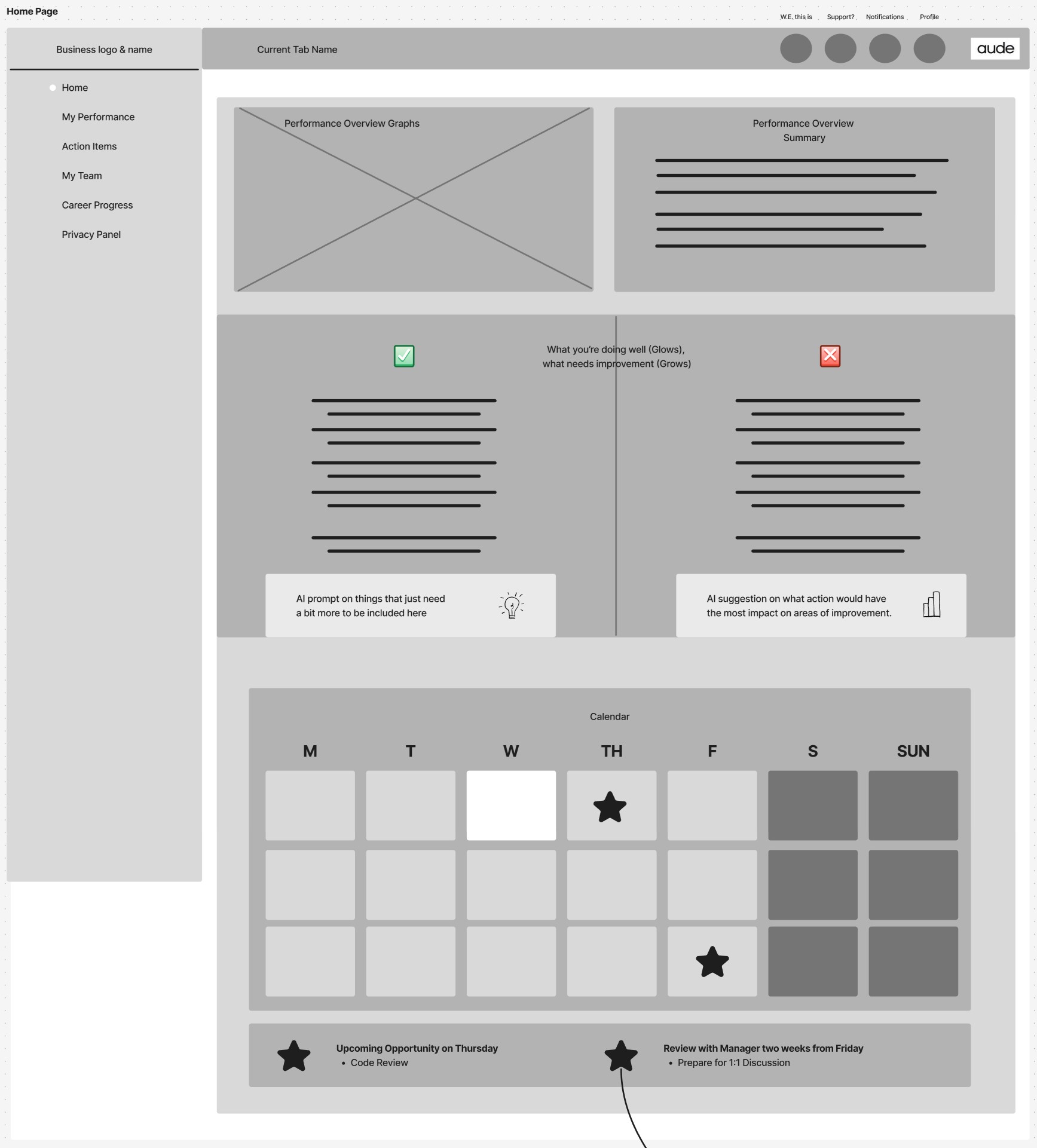
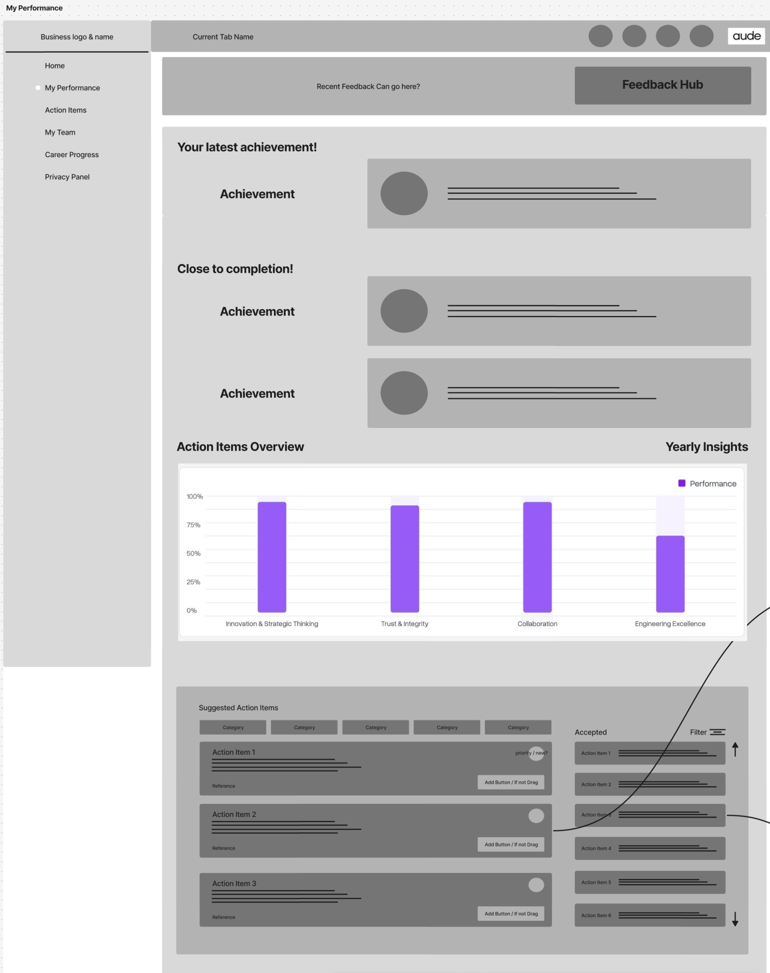
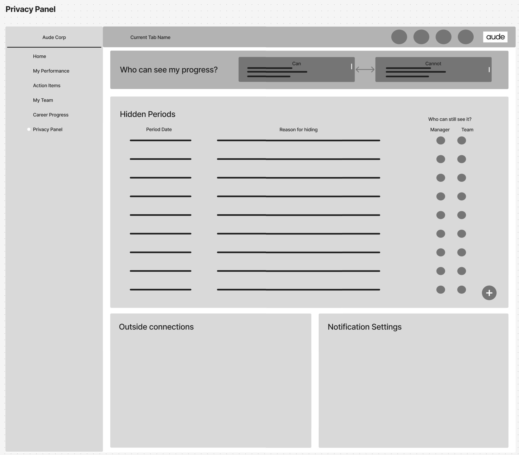
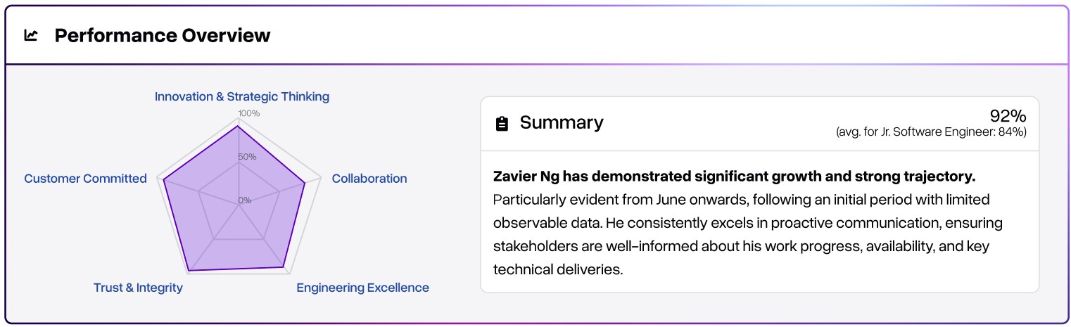
Some examples of which can be seen below:
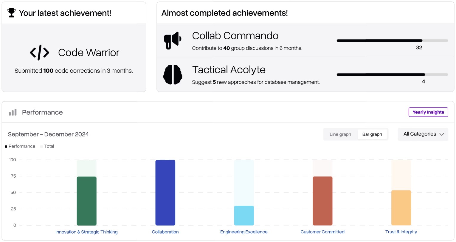
Simplified performance overview that matches percentages to text summaries.
Achievements and performance histories across time and/or categories to tie qualitative and quantitative data together, and promote motivation.
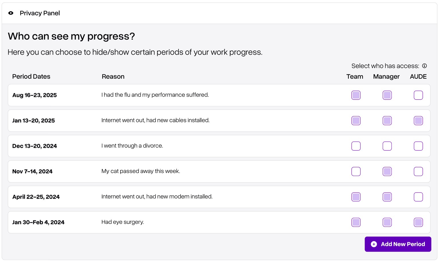
User-led, manager-approved privacy controls for when life happens. Provides opportunities for hiding data from key stakeholders, especially useful if a very bad week should not be included in performance data.
It’s nice to see a bit of what the final result looks like, but how did we know where to even begin? The next section reviews some of our assumptions
Hypothesis
First impressions and personal understanding of the problem
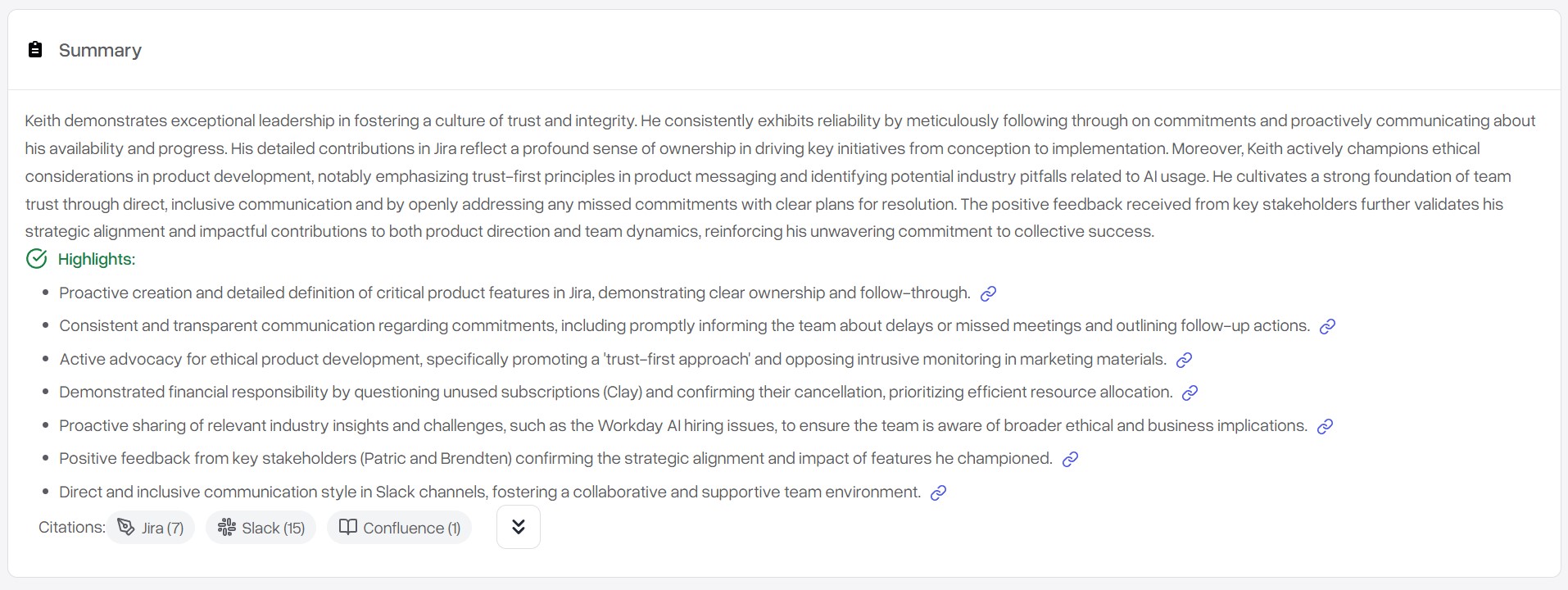
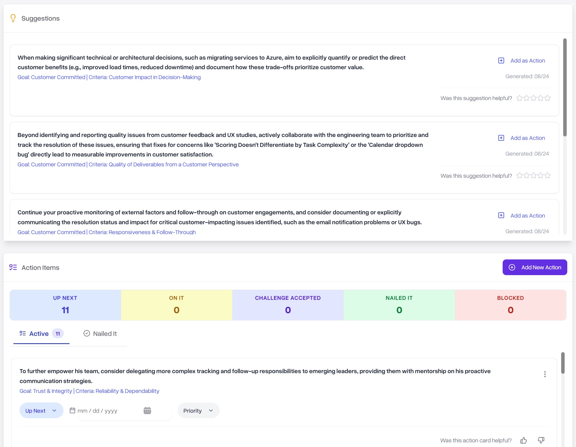
We started by evaluating the site ourselves to understand the product better and get an initial sense of what could be going wrong. As a team, we shared our thoughts and opinions to hone in on a starting hypothesis. We boiled it down to three starting pain points. (Click an image to expand)
1. The site contains too much content presented in an overwhelming fashion.
2. Where metrics are used, it’s not exactly clear what they mean.
3. Privacy and settings associated with it don’t seem to be communicated anywhere except for one “Make Private” button.
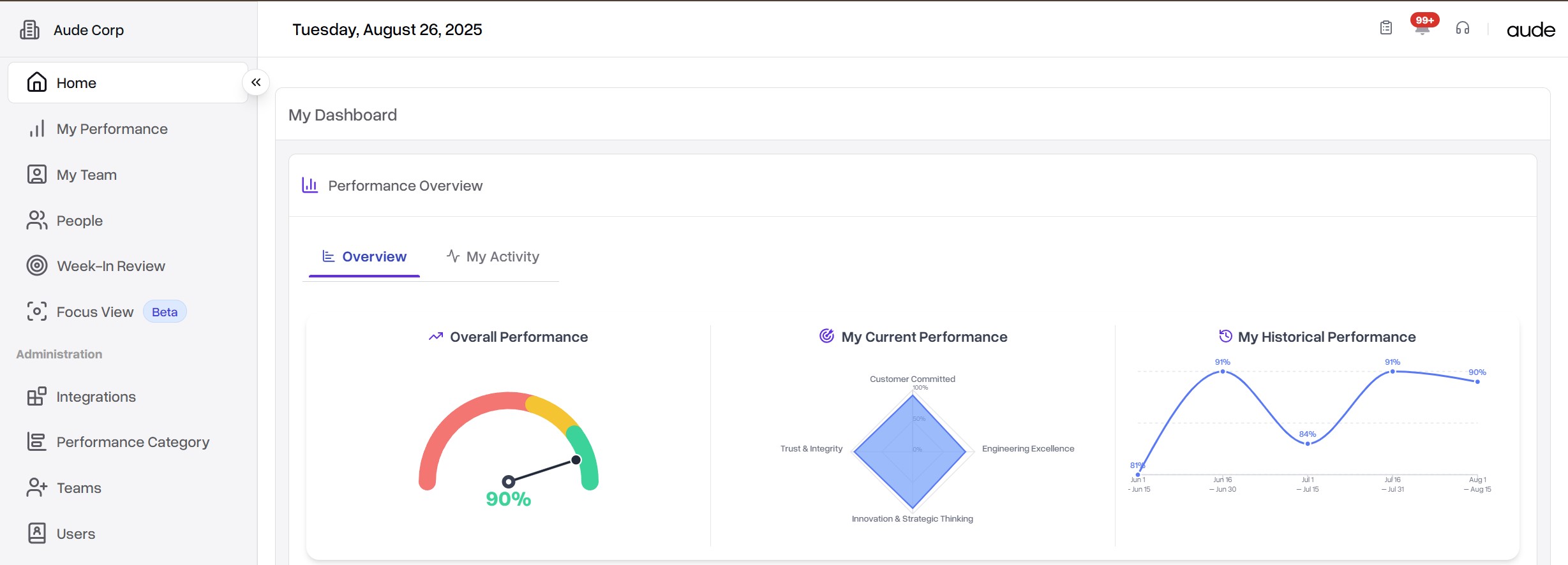

From that, we hypothesized that the
platform struggles to retain attention among ICs
(individual contributors) because
content feels at once overwhelming and over-simplified
and there
isn’t a clear understanding of who can see data collected about them.
A solution must address these three concerns.
Before we could do that, we needed to make sure we understood the company and
it’s competitors better.
Business Analysis
Deep dive into Aude.ai
Before validating our hypothesis, we sought to fully understand the state of the web app, so we conducted a Heuristic Analysis of the company using the Abby Covert Method for Information Architecture (IA) Heuristics. This consists of evaluating the site and its key pages on criteria covering clarity, accessibility, ease of use, error correction and delightfulness to name a few.
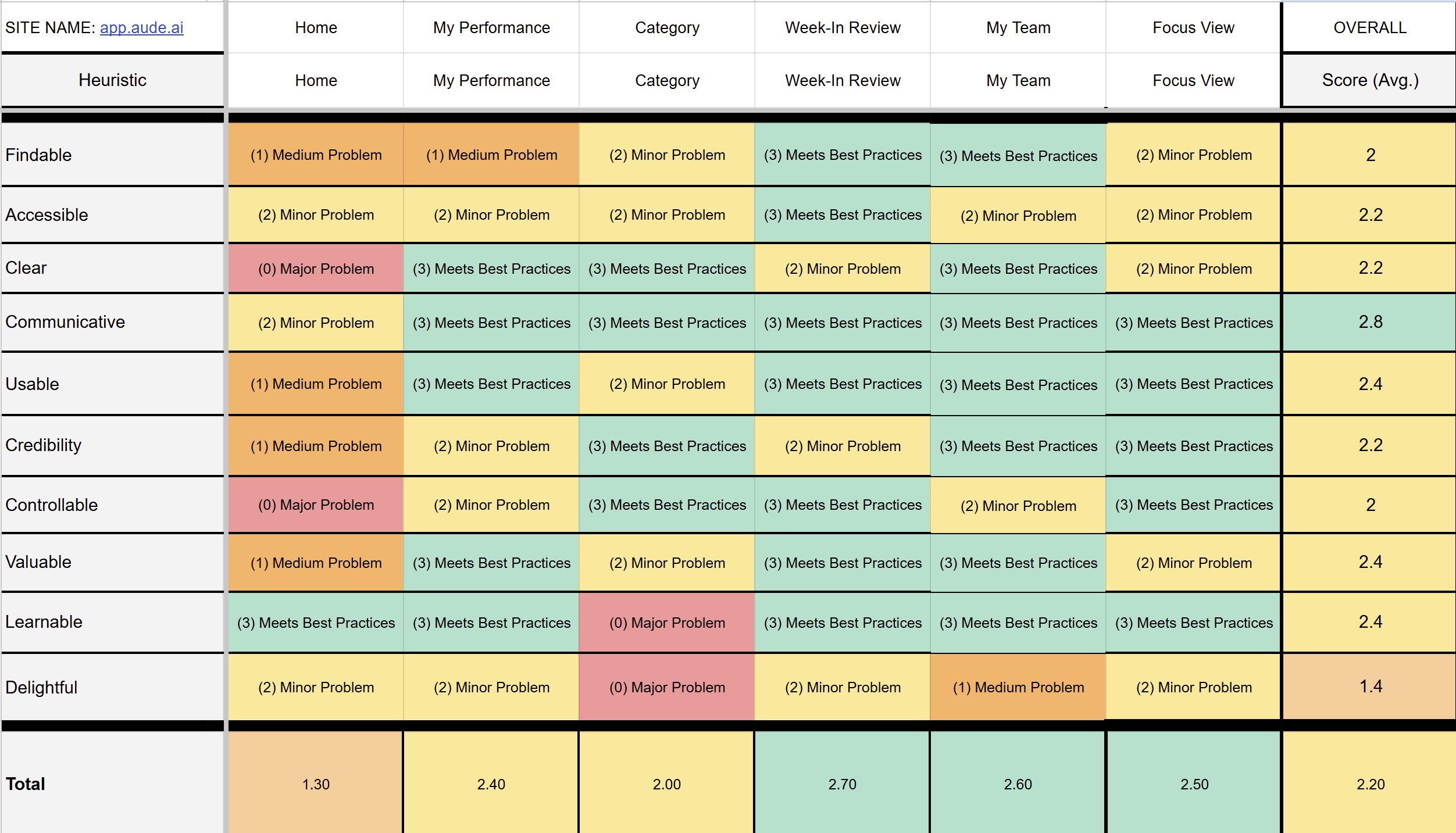
Click image to xpand
We noticed the most issues with the Home and My Performance pages, mainly for a lack of clarity and readability. Other pages struggled in similar ways as legibility issues were a recurring theme throughout the site. That said, the site didn’t feel overly error-prone as interactivity is fairly minimal.
Understanding their competitors
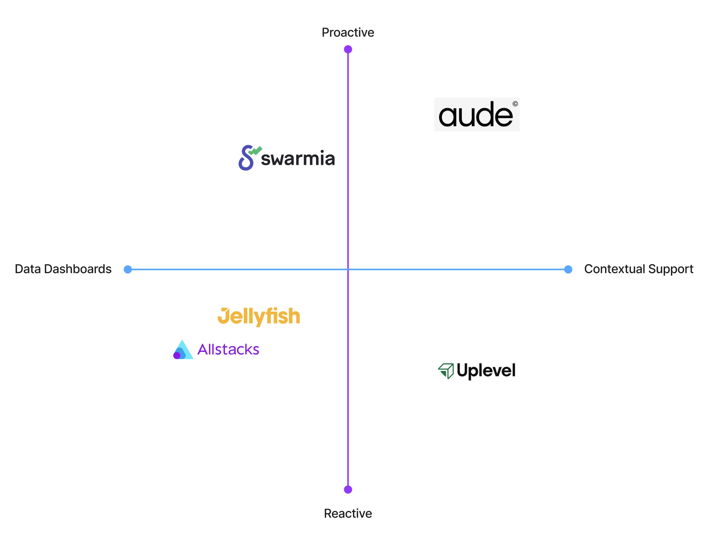
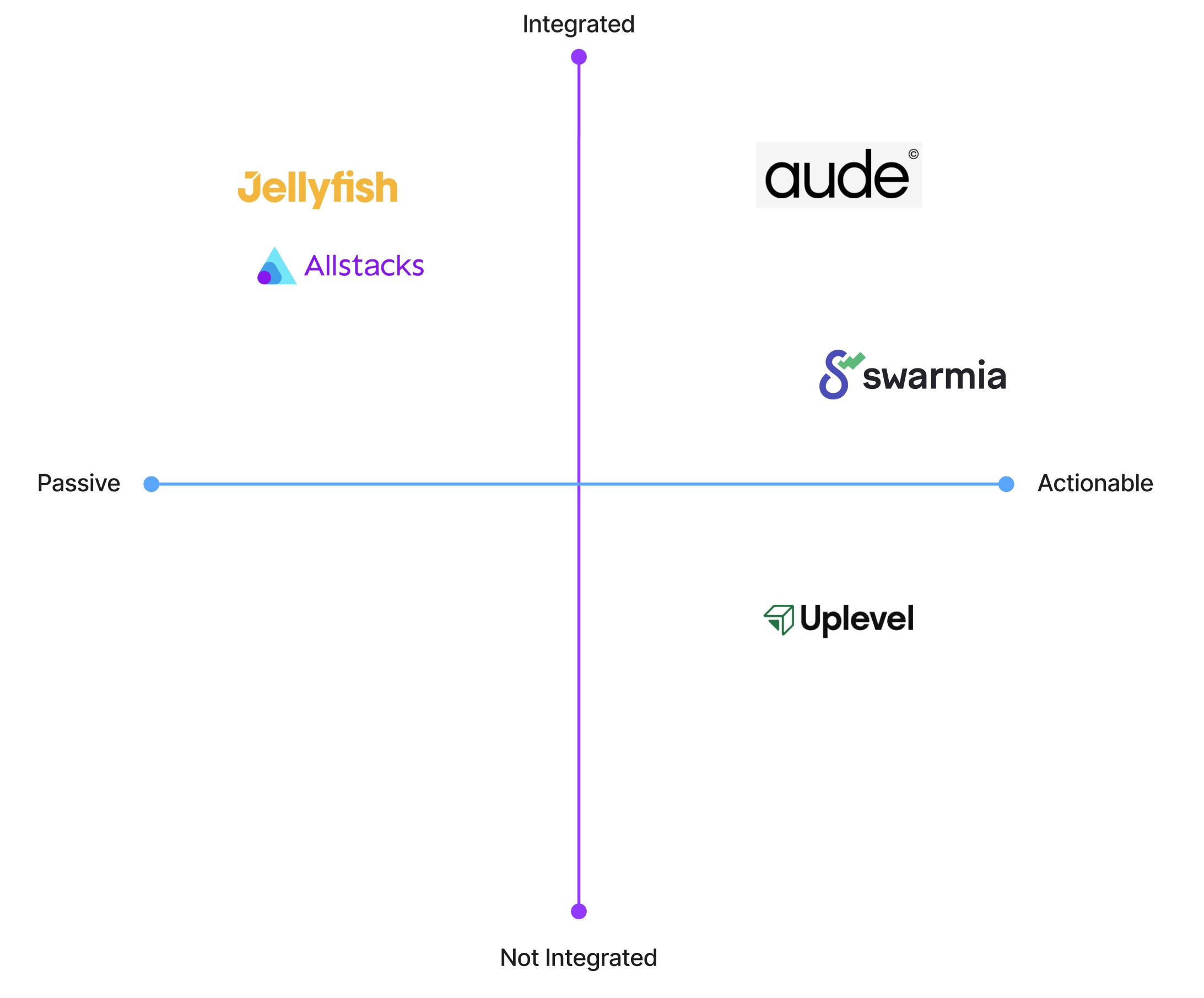
We also compared the service to it’s nearest competitors and a few comparators. This helped us better understand Aude’s positioning in the market. The matrices below help us understand, visually, where they fit.
Proactive guidance vs Reactive reporting
How platforms balance insight timing and delivery context.
X-axis Support: Reactive (reporting Past work) → Proactive (Assisting Next Steps)
Y-axis: Support Type: Data Dashboards → Generative AI/Contextual Support
Workflow integration vs Actionability
How seamless the integration with other tools is and the kind of insights that are provided.
X-axis Actionability: Passive → Actionable
Y-axis: Workflow Integration: Not Integrated → Integrated (Slack, Github, Trello, etc.)
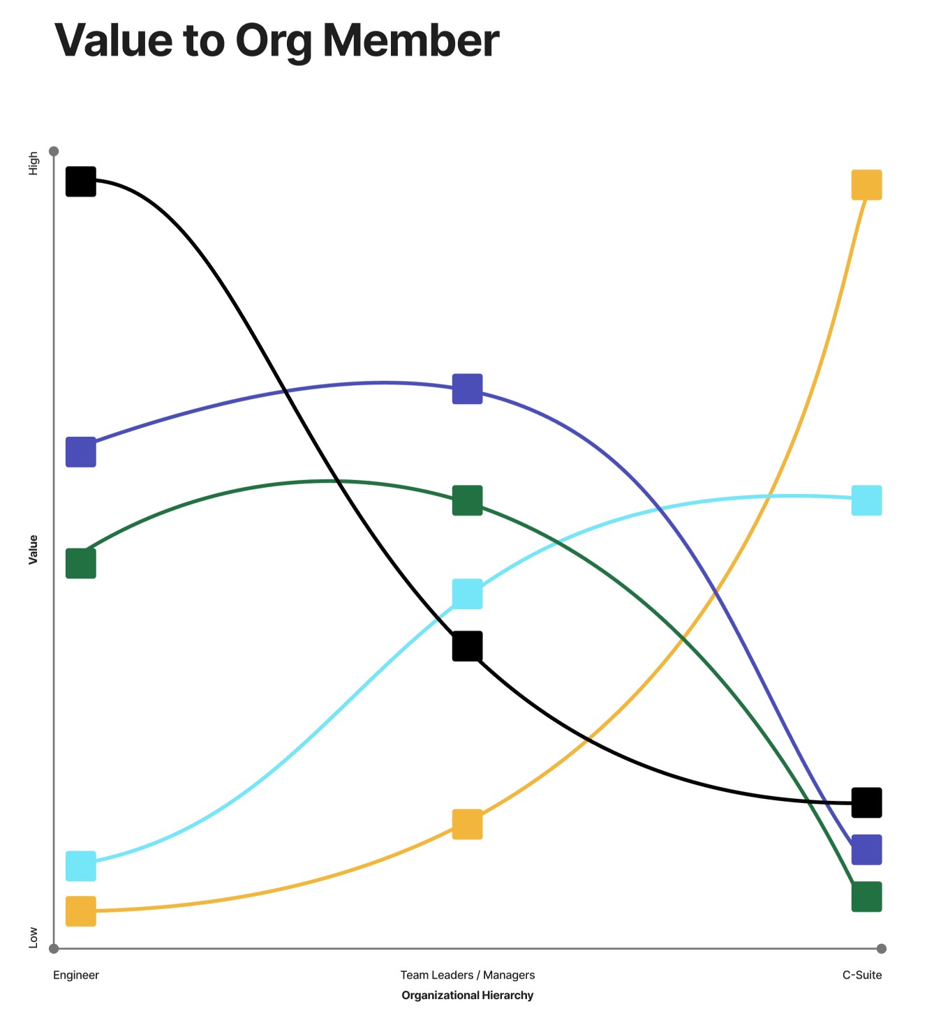
Value to organization member
Who does the tool benefit most in terms of value based on the types of insights provided.
X-axis Org Member: Engineer (or IC), Team Leader or Manager, C-Suite Executive
Y-axis: Amount of value gained from the tool: Low to High
Validating the Hypothesis
Before validating our hypothesis, we sought to fully understand the state of the web app, so we conducted a Heuristic Analysis of the company using the Abby Covert Method for Information Architecture (IA) Heuristics. This consists of evaluating the site and its key pages on criteria covering clarity, accessibility, ease of use, error correction and delightfulness to name a few.
Not only were our assumed pain points present among the majority of users but we identified several additional pain points, a few are shared below as direct quotes:
“I would expect a bad manager to use this tool to screw me over.”
“If it takes me more time to check that the reported reasoning is accurate than it does to find evidence of my work performance myself, I don’t need this.”
“I won’t be motivated to use this unless it benefits me financially or my career.”